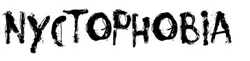
We like the look of this font for our title because the effect is very thriller-like. The jerky letters link to a 'rift' in the font, just like a rift in time and space in our opening.
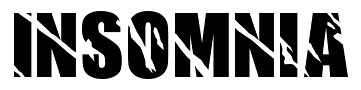
We also like this font as the breaks and cuts in the letters also link to our title. It gives a hint to what is to come.
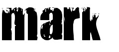
Another font is this one - all the fonts we are interested in using have breaks and cuts in the letters, linking to our title.
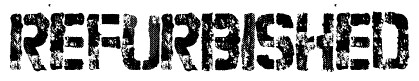
This is the fourth font we are considering for our thriller opening title. It has a broken effect like the others but the boldness compared to the white gaps really stands out and sets it apart from the other fonts.
No comments:
Post a Comment